PART 185
I am only too well aware there are all sorts of Underwood
hybrids out there, but this is ridiculous. Positively weird. For all money it looks like a 1930s
side-panelled Underwood No 6 or Standard Champion with a mid-1950s finish, decals
and keytops. The serial number is 4578746 (is there a stroke and a 1 after
that?), which ostensibly places it at about 1937, but that’s surely not possible
with the changed Underwood logo and the keytops.
So when was it made, and why
was it made this way?
Willie Dobson's 1948 design for the Underwood Rhythm Touch
I set out yesterday to post on Willie Dobson’s 1948 makeover of
the Underwood Standard. I went looking on the web to find examples and first-up
came across Alan Seaver’s Underwood Rhythm Touch at Machines of Loving Grace.
Alan notes, “I was surprised to find that this specimen dates to the early
1950s, because it looks much older.”
Underwood Rhythm Touch: Alan Seaver Collection.
Note the new-style decals and the lever.
I knew I only had one Underwood Standard approaching this in
finish, but when I took it out to clean it up and take a closer look at it, I
was astonished by the realisation it was a mix and match, stuck somewhere
between the Dobson and Paul Braginetz design eras. It’s a crossbreed, representing both the old and the new of Underwood Standard designs. It has the 1950s finish and
decals of an Underwood SX-100, but the frame and carriage return lever set-up
of a 1930s Underwood 6.
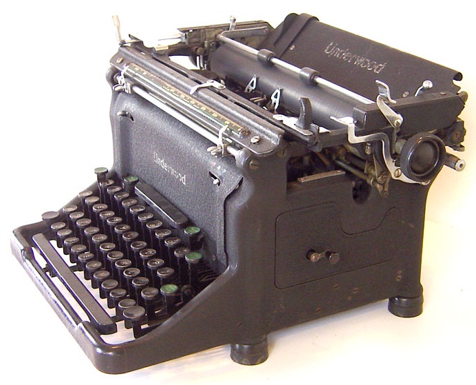
This Underwood No 6 or Standard Champion is identical
except for the decals and keytops (and a bit more chrome on top)
The fact that it was made in Toronto (and either originally sold
and/or later serviced in St Catherines, Ontario) may offer some hints. Maybe.
I have to confess that I have no idea how or when I came by this
machine. All I do know is that it has always strangely appealed to me – now
perhaps I have a clue as to why. I always knew it was a good typer, which is
one of the reasons why I was never inclined to off-load it. It was one of those
typewriters that for years sat in storage with a “Will get to it one day” label
on it. Then it came over here from storage and for some months again mildly called, “Deal with me.” So yesterday I finally did.
One of the things that gnawed away at me was the large chunk out
of the middle of an otherwise striking front decal. I loved the decal, and hated the fact it was so badly damaged. That was one of the things
I dealt with yesterday. With some careful planning, measuring, font matching,
WordArt work, transfer printing and snipping, I was able to make the ugly hole
in the decal just “go away”. I think it looks absolutely marvellous now.
Basically, the history of the Underwood Standard’s frame design
is that it didn’t change an awful lot from Franz Xaver Wagner’s 1892 Wagner
through to the No 6 of 1932 onwards. That is, the carriage structure and the
smiling gap beneath it, exposing the typebars, stayed pretty much the same for
almost 40 years.
Underwood 6 Standard Champion
Putting aside the Noiseless of the early 1930s, which
Remington made anyway, the smiling gap wasn’t closed off until the “Master Model”
of 1939, as memorably seen in the giant model made for the New York World’s Fair of that
year. This appears to have been followed by the Underwood S series.
Richard Polt's Underwood S from 1943. It has the side panels but a different ribbon movement lever and the original Underwood decals.
Another significant change occurred in 1947, with the Rhythm
Shift model, which marked the Underwood Standard’s conversion to basket shift,
but which retained the original carriage return lever set-up.
Then came Willie Dobson’s Rhythm Touch in 1948, which did away
with the small carriage return lever which had served Underwood so well for more than
half a century and introduced the long, drooping carriage lever. This was succeeded by the Underwood SX-100; the Model
150 was introduced in 1955, followed by the Touchmaster two years later.
A patent application for Willie Dobson’s radical re-design for
the Rhythm Touch was filed on this day (November 24) in 1948 and issued at the
end of May 1950. Dobson’s only reference in the design was to Henry Dreyfuss’s
re-design of the Royal Quiet DeLuxe portable in 1946.
William Albert Dobson was Underwood’s chief design engineer for
almost 30 years. Born in Tolland, Connecticut, in November 1870, he started working in Hartford as a toolmaker,
then as an automobile engineer. He went to work for Underwood as a toolmaker
after World War I and quickly rose through the ranks to become Underwood's factory
superintendent in the late 1920s.