


Images by Georg Sommeregger
Ah well, this was only ever going to be a quick, slap-dash demonstration, anyway, so it can all be undone just as rapidly as it was done. These mistakes aside, I must confess I haven't done a very good job anyway. But this only underlines the obvious limitations in making decals by the process I use.Actually, I was hesitating to post on this. The main reason being that I didn't want anyone to get the impression I have mastered the "art" of typewriter decal-making. Far from it. I didn't want anyone waiting excitedly for "secrets" to be revealed. I have been experimenting with decal-making for many years now and am still a very long way away from perfecting it. I will almost certainly never perfect it. The process is actually very simple, but there are severe restrictions in what I can do with the basic materials and programs available to me.
For one thing, if anyone needs to replace a decal on, say, an old Corona or a Remington, and needs an exact replica, by far the best thing to do is to approach Paul Robert in Amsterdam. Paul uses a process - I have no idea what it is - which produces the exact decal in the bright, glowing gold of the original. I cannot do that. Using Microsoft Word and WordArt and the colours that come with them, this is impossible for me to do. If you want the right decal for your old typewriter, in the right shining gold, you would be much better off going to Paul and paying for it to be done properly.

An example of a proper decal transfer, supplied by Paul Robert of Amsterdam.
There is doubtless a printer capable of reproducing the gold glint of original decals.
The process I use is for amateurs such as myself, who rely on basic Word, WordArt and just an ordinary printer.
To give an idea of cost, a complete set of Corona 3 decals from Paul cost me about 20 euros, plus postage.
methFor me this is just a fun thing to do. It's part of the hobby. I only do it when I have a battered typewriter that is crying out to be repainted and given a new lease on life. And then more often than not when I am using a light coloured paint, because these transfers generally don't show up so well on dark surfaces. This is another reason I was delaying posting on the process I use, since I was waiting for another typewriter to turn up needing a repaint, like the Golightly-Riter, the now pink Remington portable that led to these calls to "share the knowledge".There is doubtless a printer capable of reproducing the gold glint of original decals.
The process I use is for amateurs such as myself, who rely on basic Word, WordArt and just an ordinary printer.
To give an idea of cost, a complete set of Corona 3 decals from Paul cost me about 20 euros, plus postage.
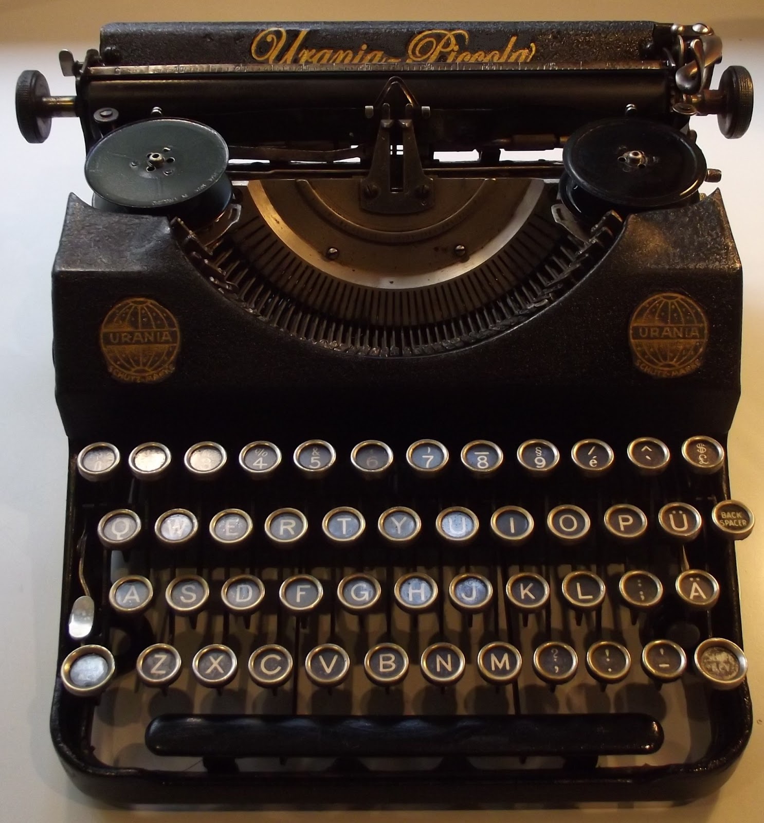
Then I came across the decal-less, crinkle-surfaced Urania-Piccola that I picked up in Brisbane on the morning of the Type-In at the Breakfast Creek pub. After seeking and getting help in identifying this machine, while "On the Road with Typewriters" in Queensland, and seeing how great it looked on Georg's web pages with its very prominent decals, I thought I might try to make my own decals for it. Why not use it for this demonstration? I reasoned. Not a really clever decision, since the process I use will never work well on a black surface. I almost got away with it with a Hermes Baby that I repainted in its original black some weeks ago (again using one of Georg's decals images), but that was an exception which didn't prove any rule.
A good friend, seeing the comments on the Golightly-Riter, jokingly remarked, "Don't let on the secrets of how you did that pink Remington. If a magician doesn't give away his secrets then it's still magic. I like it that way!" Well, I'm afraid there is no magic. It's all very straight forward. I will go through the process step-by-step here, as I went through it with the Urania-Piccola this morning, but I will be at pains to stress the limitations. PLEASE, this is just a bit of fun, playing with making decals, it's not to be taken too seriously:
WHAT YOU NEED


1. Testors decal paper. It's the only brand to use, as far as I am aware. This comes in packets of six A5 sheets, in "Clear" or "White". Learn to use the sheets sparingly. I used to be able to buy these at a hobby shop around the corner, but as that shop has now closed I buy them online and ship them in from the US. It adds up to about the same cost - about $US20 plus postage (so between $4 and $5 a sheet all up). The service I use is quick and reliable.
"Clear" transfers are used when employing dark text or images and applying it to a light-coloured surface. This is by far the best arrangement - it generally works pretty well. However, I used a "White Background" transfer sheet for the Urania-Piccola. This meant printing on to a "solid background" transfer sheet a black background layered underneath the goldish text and image. If I had used "Clear" for such a job, the text and image would be simply transparent and would not show up at all on the dark surface. This is the main limitation with this process.
2. Acrylic spray paint. After printing the transfer and letting the print dry, the transfer sheet must be sprayed with an acrylic paint, otherwise the type or image will simply wash off.
3. A small container of cold, clean water, paper towels, a pair of small, sharp scissors and toothpicks.
THE PROCESS
1. Creating the Word document. I use WordArt for the text, because it enables me to re-size the words to any width and depth I want, and to position them on the transfer sheet document wherever I want. First I type the word or words using ordinary Word, and play around with them until I have the font I want. Then I edit the WordArt, applying the font I have settled on. Set out to make maximum use of each A5 transfer sheet (especially to have spares in case of mistakes when applying the decals), so make sure to remove the words typed in Word.

With WordArt, I can have different colours and thicknesses for the borders around the characters, and different colours inside. Take this transfer for the Golightly-Riter as an example. WordArt offers plenty of options for manipulating text and symbols when coming up with designs which suit the job best:

Here I have made the name a goldish colour and layered it on top of a solid black background:

Here I have added Georg's logo image, plenty of copies just in case (and to get more use out of the transfer sheet):

It's probably best to follow Testors' printing instructions and to not use a "Best" printing option. Testors advise "Normal" and "Plain Paper" printer settings. With my printer, I found it a good idea to also ask for slow drying. This is especially so when using a dark background under a lighter text, as the dark background can sometimes come out slightly faded or can have streaks through it:


When the print has dried, apply the acrylic paint. Clear gloss spray paint will also work, but will probably give a shinier surface than acrylic. When using a solid black background to the text and image, such as in this case, the object is to blend the printed black as closely with the typewriter's black paint as is humanly possible - so the transfer itself doesn't stand out. That's the big challenge. Your objective is make the decal "look right", as though it belongs there, and not to appear to be so obviously an add-on.

While the acrylic paint dries, get ready for the last stage. Put some cold, clean water in a small container, cut around the transfer without removing too much background, put it in the water for a few seconds (20-30 seconds absolute tops). Take out the transfer before the surface leaves the backing paper in the water. Dry it on some paper towelling. Place the transfer in the correct position and slip the backing paper out from underneath it. Then lightly but firmly dab the transfer with a paper towel. If there is a slight curl on any edge, use a toothpick to straighten it out. Make sure there are no bubbles under the transfer.


It's always a good idea to have spare decals in case of problems. So use as much of the A5 transfer sheet as possible.
If you have any queries with any of this, please contact me.

If you have any queries with any of this, please contact me.

FAIR AND BAD EXAMPLES
(Which go to prove I'm still an amateur at this)
(Which go to prove I'm still an amateur at this)

One of the very first restoration jobs I did was on this Smith-Corona Silent for Richard Amery. I had to use car decalling strips for the lines on top of the ribbon spools cover. It worked out pretty well. Below is another of Richard's typewriters which I transformed:


A much more recent undertaking was the "Polt-Righter". It's easy to see that dark text on a lighter surface works so much better than light text on a dark surface. With this one, I also used a plastic texture paint under the top coat. See also the Golightly-Riter:


PERSONALISED
Very simple jobs are usually the best - less that can go wrong!


VERY POOR JOBS, FOR OBVIOUS REASONS
(I really should have destroyed the evidence!)

.JPG)

10 comments:
Thank you! That is most awesome, and many of those typewriters I can't recall seeing before! (:
Awesome post! Knowing your process I'm actually more amazed at the makeovers you did. I can't see the edges of the decals at all where they meet the body of the typewriters. Did you cut the letters for polt-writer and golightly right to the edge and in the middle of the letters? If not, the background colours of the decals are spot-on!
Thank you so much Ted and inkleaves.
With the Polt-Righter and the Golightly-Riter, I was able to use the "Clear" rather than "White" transfer paper, which is my much preferred option, but only works on light-coloured typewriters. As the text etc appears in dark print on a transparent ("Clear") transfer, the trimming presents no difficulty at all. The surface of the typewriter (whatever light colour) becomes the background.
THANK YOU ROBERT! Beautiful work. I am off to the shop to get the necessary supplies!
Nice post! I once bought a Blickensderfer decal from Paul Robert, but after I put it on, it looked bad on the machine: it was just too obvious it was plastic (shiny), quite disappointing. In the end, I washed it off again. Maybe I did something wrong, I don't know. I was happy it didn't harm my Blick, though.
Thanks for posting your process. I liked all of them for different reasons.
My favorite has to be the red, white, and blue Olivetti. Thanks for sharing!
Another string of pearls from the wisdom chest. Thanks, I suppose it is only for the want of looking that I didn't know anything about desktop transfer solutions. In a way that's a good thing looking back. It was only when the decals had gone that I decided to take my Underwood down to bare metal and leave it there. But now I know and it will surely be a useful reference. Thanks again Robert.
Thanks, Robert, very interesting. I've never tried making decals myself (yet!).
How'd I miss this post back in March?
I found this while searching for typewriter decals for a project.
You've done some really great work Robert.
Thanks for the post.
Post a Comment